
You are using an out of date browser. It may not display this or other websites correctly.
You should upgrade or use an alternative browser.
You should upgrade or use an alternative browser.
Art stuff by Bunnies
- Thread starter ItMustBeBunnies
- Start date

ItMustBeBunnies
Bugger off, you brolly!
Just a few quick ones I have made in the past week.




MinwaraYana
Countess Von Drunkaton

BuffyElevated
Scooby
Aly Fan
MeowCluck!
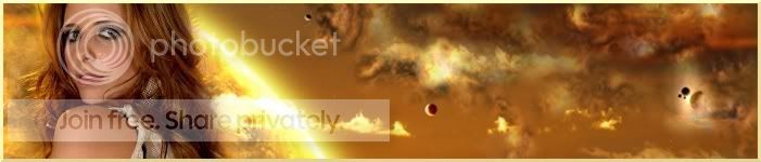
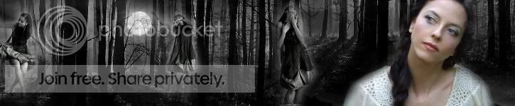
I love the one of Aly...she looks so good in those photos...and i also like the one of Dru in the forrest...awesome 😀

ItMustBeBunnies
Thanks hun! :)
DrusillaRox
You wanna date my avatar
See, bunnies! I told you to stick with the dru one, It's awsome!
ItMustBeBunnies
Lol, Thanks Dru! *hugs*
Blair Waldorf-Bass
je suis prest
- Joined
- Oct 1, 2008
- Messages
- 876
- Age
- 37
Absolutely gorgeous sweetie! Your work keeps on getting better and better! 🙂
ItMustBeBunnies
Awww thanks! *hugs* :)

Airam
Zen baby.
Ooh, great new batch hun! The Juliet one with the glasses is so cool! 🙂
ItMustBeBunnies
Thanks! *hugs*
TheChosenTwo
A Vision of Hotliness
bloody pet
Spikes a vamp with a bite
DRUSILLA!If I just didnt get this banner from nix but can I use the first dru one I love it keep them coming.
ItMustBeBunnies
Bugger off, you brolly!
My first wp:
http://i407.photobucket.com/albums/pp153/jella23/bangelshmangel.jpg
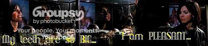
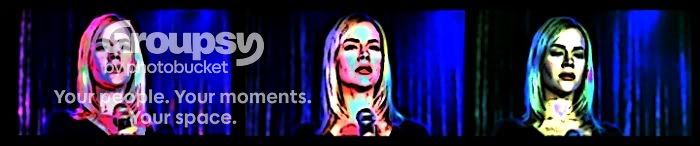
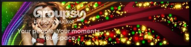
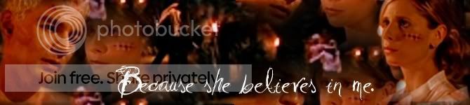
And a few banners that I made today:
http://i407.photobucket.com/albums/pp153/jella23/bangelshmangel.jpg
And a few banners that I made today:

Friendly Lurker
Spuffy!

Airam
Love, love, LOVE the Darla, aly and Spuffy banners! And the wp turned out great, like the overlapping polaroids :)
B
bloody pet
ok one how did u do that wp i was looking to do something like that and cant fig it out and where did you get those text for the spuffy and dangel ones?
P
Perny
Guest

definition of insane
Hostile 17
ItMustBeBunnies
Bugger off, you brolly!
Some more banners:
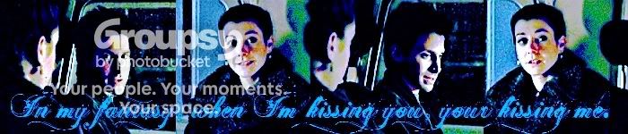
Airam
saved the Willoz one for near future use, thanks darling! :)

caitaintdead
I am in LOVE with that Anya banner.
A
anyalover17
Absolutely gorgeous Anya banner!
Airam
Zen baby.
I can't even pick a favorite from that bunch, they're all awesome!!! .... Maybe my fave is the Willoz one, I can't stop looking at it its so purty!
ItMustBeBunnies
Awww, thankyou so much!. If you like, that Willoz one is yours darlin:)
J
JenniferAlice
Guest
Aww, wows! I luve the Darla and Willow ones in the previous post!!
And I love, love, love the Anya one and Buffy one! Sooo pretty!!!!!
And I love, love, love the Anya one and Buffy one! Sooo pretty!!!!!
BuffyElevated
Scooby
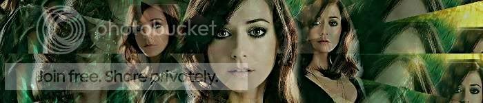
OH, WOW!! I absolutely LOVE the Anya one... I love that it looks like a kaliedoscope. 😀 And the Woz one is brilliant. 😉
ItMustBeBunnies
Thankyou so much Britt! *huggles you*:)
Blair Waldorf-Bass
je suis prest
- Joined
- Oct 1, 2008
- Messages
- 876
- Age
- 37
DrusillaRox
You wanna date my avatar
Argh!!!! I love your stuff!!!! You're so creative! I missed you! 😀
ItMustBeBunnies
Awwww thanks darlin! I missed you too! *hugs*

Angelic Slayer
Daydream Believer
I can't believe how long it's been since I've stopped by! *slaps my own hand*, alrighty, here's my low-down...
Older Posts...
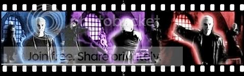
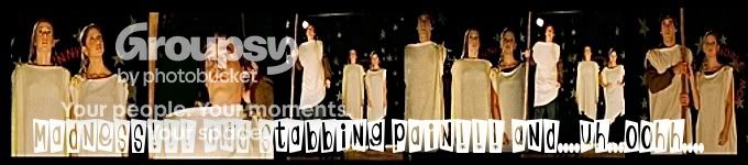
I think I saw this one as someone's signature a while back, you did a really neat job with it! Great idea to use the film-like border to capture the scene, and I don't know how you did the cool light around Spike, but it really made him stand out in the banner. The colouring was a nice touch, too.
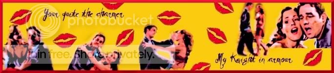
So this one's a little more simple, but I did want to talk about the AWESOME image placement and give kudos where they're deserved! In my experience placing screencaps like that takes a lot more time to blend them properly than making them full the height of the banner. I'm glad to see you experimented with image placement a bit!
Next Bunch...
I see that you started using textures more here, awesome! I really like how you blended the Eliza on the far right, particularly the left side of her face. The white around her works for the banner, but I think it would have been nice to see her all blended in. Other than that though it is a great banner, and with a "3-D" kind of border too (I still don't know how you people do that! 😉 )
This one turned out really well, it was a great call to use a background with a similar colour scheme to the original background of the SMG photo. Because you did that it works nicely with her skin tones, I never would have thought to do that!
Wow! This one's like a kaliedoscope kind of pattern, I don't know how you came up with that but I like it! Very unique! And I'm glad that you left it blank, too. This is definitely an instance where text wasn't necessarily needed, I think. My fave of the bunch 😀
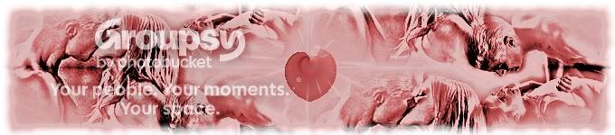
Again, thinking "outside the box" with this one. I like the size and light differences with the four photos, and I'm not sure if you made the "curled paper" effect or not, but it was a neat thing to include in the banner. It just wouldn't have been the same without it!
Your First Wallpaper: Well first of all I actually laughed out loud at the captions, that was a great idea! Putting the caps together as polaroids on a table told the "story" well, and the background pattern matches the effects on the photos I noticed, too. Not bad at all for your first wallpaper, I hope you make more soon! This one was a hoot!
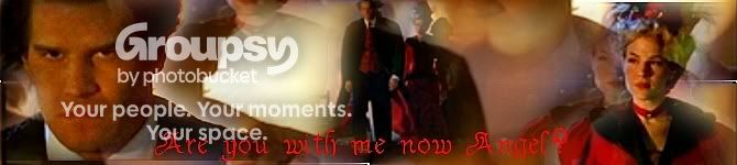
This one was just SO different from your others so far that I wanted to bring it up. Excellent choice in font and it's great to see that you tried the "non white edge" blending on a few banners. That along with blurring the center screencaps made for a well- rounded banner. The image just beside the left-side Buffy is a little tricky to make out, so I might have chosen a different one, but overall it's a really nice banner (for a Spuffy banner, anyway) :silly:
From April 12....
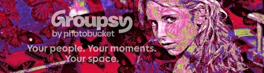
Sarah Michelle Butterflies: REALLY neat effect, way to go! The butterflies don't overpower her features either, which with that crazy of a pattern is WOW worthy.
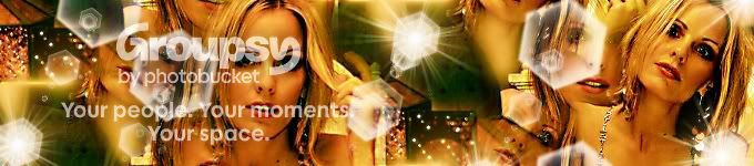
Anya Banner: Cool blending, I like that you used just the diamonds (or whatever they are!) and "shiney-things" to brighten it up-- but didn't go too overboard. I like where you placed the main Anya image as well.
---
Overall you're coming along really quick IMBB, and I'm SO glad that you're doing a lot of updates! I looked over it again, and just a couple suggestions for the next bunch maybe...
- Image quality: in most of your banners you've done really well in keeping your photos looking nice and clear, but a couple of them are a bit "pixel-y" which make some parts of those banners hard to make out. So not a huge deal, most of them again are crystal clear, but just be careful about that when resizing your images 🙂
- I'm not quite sure how to do it in GIMP, but if there's any way to experiment with how your text looks (shadows, putting lines around it or shapes behind it, writing in different sizes or putting it on different angles, etc) that might be something to try. You're doing great on the image parts of your banners, so it might be fun to try out some different things with text too. Just a thought!
Mostly just keep doing what you're doing hun! You've got a great knack for coming up with different banner designs, so just keep having fun with it. You are coming leaps and bounds already, I can't wait to see your next posts :thumbsup:
Older Posts...
I think I saw this one as someone's signature a while back, you did a really neat job with it! Great idea to use the film-like border to capture the scene, and I don't know how you did the cool light around Spike, but it really made him stand out in the banner. The colouring was a nice touch, too.
So this one's a little more simple, but I did want to talk about the AWESOME image placement and give kudos where they're deserved! In my experience placing screencaps like that takes a lot more time to blend them properly than making them full the height of the banner. I'm glad to see you experimented with image placement a bit!
Next Bunch...
I see that you started using textures more here, awesome! I really like how you blended the Eliza on the far right, particularly the left side of her face. The white around her works for the banner, but I think it would have been nice to see her all blended in. Other than that though it is a great banner, and with a "3-D" kind of border too (I still don't know how you people do that! 😉 )
This one turned out really well, it was a great call to use a background with a similar colour scheme to the original background of the SMG photo. Because you did that it works nicely with her skin tones, I never would have thought to do that!
Wow! This one's like a kaliedoscope kind of pattern, I don't know how you came up with that but I like it! Very unique! And I'm glad that you left it blank, too. This is definitely an instance where text wasn't necessarily needed, I think. My fave of the bunch 😀
Again, thinking "outside the box" with this one. I like the size and light differences with the four photos, and I'm not sure if you made the "curled paper" effect or not, but it was a neat thing to include in the banner. It just wouldn't have been the same without it!
Your First Wallpaper: Well first of all I actually laughed out loud at the captions, that was a great idea! Putting the caps together as polaroids on a table told the "story" well, and the background pattern matches the effects on the photos I noticed, too. Not bad at all for your first wallpaper, I hope you make more soon! This one was a hoot!
This one was just SO different from your others so far that I wanted to bring it up. Excellent choice in font and it's great to see that you tried the "non white edge" blending on a few banners. That along with blurring the center screencaps made for a well- rounded banner. The image just beside the left-side Buffy is a little tricky to make out, so I might have chosen a different one, but overall it's a really nice banner (for a Spuffy banner, anyway) :silly:
From April 12....
Sarah Michelle Butterflies: REALLY neat effect, way to go! The butterflies don't overpower her features either, which with that crazy of a pattern is WOW worthy.
Anya Banner: Cool blending, I like that you used just the diamonds (or whatever they are!) and "shiney-things" to brighten it up-- but didn't go too overboard. I like where you placed the main Anya image as well.
---
Overall you're coming along really quick IMBB, and I'm SO glad that you're doing a lot of updates! I looked over it again, and just a couple suggestions for the next bunch maybe...
- Image quality: in most of your banners you've done really well in keeping your photos looking nice and clear, but a couple of them are a bit "pixel-y" which make some parts of those banners hard to make out. So not a huge deal, most of them again are crystal clear, but just be careful about that when resizing your images 🙂
- I'm not quite sure how to do it in GIMP, but if there's any way to experiment with how your text looks (shadows, putting lines around it or shapes behind it, writing in different sizes or putting it on different angles, etc) that might be something to try. You're doing great on the image parts of your banners, so it might be fun to try out some different things with text too. Just a thought!
Mostly just keep doing what you're doing hun! You've got a great knack for coming up with different banner designs, so just keep having fun with it. You are coming leaps and bounds already, I can't wait to see your next posts :thumbsup:
ItMustBeBunnies
Wow, thankyou!:).