Arty People I need ur help?

Black Eye Guy

Taking over the World!
Joined
Aug 16, 2005
Messages
8,904
Age
39
Location
Ireland
Black Thorn
Ok so I have my Art Exam next week, we got the exam papers yesterday, and I have to make a poster on the theme of "10th Annual Film Festival", My first Idea was to have the lettering "10th Annual Film Festival" in the top left, Then have a film negative kinda sown threw it, like it will be an actual negative from a camera coming up off the page, that will go across the middle, then in the bottom, a popcorn box will stick op off the page, as will the popcorn, and a straw, Then my teacher said I should have a pic from a movie(Drawn) on the top and put the text on the film negative, so it would kinda look like this(But better ,lol,)
The red is the negative, the Orange the popcorn box and the Blue the straw.

So anyone any comments, negative or positive or any ideas??
Thanks
BEG!
 
OK, i don't think i class as 'arty' but i know Movies Festivals and Posters, being i have studied them and am currently teaching Film at Uni level.

One of the great things about these posters, is the effort that goes into them to look amateurish, so thats something you should be aware of.

Thats a picture of River, though i don't like Serenity, but i think thats not the right way to go.
I personally believe you need something a lot more Iconic, something that stirs an image in everyone who sees it, not just fans of it.
For instance, its almost Cliche now, but everyone, those who have seen it or not, have some kind of thought regarding Audrey Hepburn in that Black Dress holding the Cigarette, the gorgeous Necklace and that dress at a table.
Breakfast-At-Tiffanys-Vertical-Print-C10283126.jpeg

Link to it incase it doesnt work

Now i'm not suggesting you use this image, infact i would suggest against it, my point is, this image is so ingrained into the subconcious of society it does invoke a response by anyone, which is what a Poster should do.

Though as a person, Hepburn is one of the most fabulous ones to draw, structurally she is almost perfect, nee IS perfect, she beautifull lends to black and white, and almost instantly recognisable to anyone in this part of the world.

OK, so this is really not what you wanted, i just think that on a personal level, this task should not be taken on from a 'Arts' direction, should come from Movie direction.

The Negative stuff yuou have suggested is pretty cool, again with Cliche, but this is one area Cliche is cool, almost all movie works Cliches.

OK, well thats my two penneth, you 'Arty' people can tell BEG what to do.

Ohh here are a few other Pics that are really cool with Miss Hepburn.


Link to another Classic

Link to more Classic

Absolute Classic

Ok, i'll shut up now
 
Black Eye Guy
Black Eye Guy
I totally get what u mean, Thank you so much, excellent advice!
^ *points upward to the post above me* What he said 😉

DDLM has some good suggestions, and I too can totally get what he's saying, so my advice would be to follow his advice lol. Although I wanted to tell you that I loved the layout of your idea and especially your placement of the "10th annual film festival"! Maybe it's just me but that's something that if I saw I would immediatly understand, and it's somewhat classic too but not overdone so I definitely love how you included that in your design. 🙂
 
Thanks guys that really helpful! 🙂

I have a second Idea, This one is collage.

Here

you can't really see the writing, but they say funny stuff, like above the LOTR guys at the bottom, "We there yet?" or the Kids from Narnia "How big is this closet?"
 
Angelic Slayer
Angelic Slayer
Oh wow! I LOVE that! I'd pay money for a poster like that one =D
BEG, I like the use of diagonals and repetition of shapes you got goin on, good stuff. Dia's got a point about the appeal of the iconic. Humans are always gonna respond to a huge human face, it's only natural. Showing sprockets, film reels, etc is the most common film festival symbolism in the world, obviously. Maybe you're familiar with these, but your stuff was reminding me of some designers I really admire:

Saul Bass, one of my heros. You can still see people ripping off, quoting his style at this very moment. Very simple, flat colors, geometric shapes. You could recreate most of his work with paper and scissors.

http://www.saul-bass.com/
http://www.cinemacom.com/saul-bass.html


Also, the Russian Constructivists. Really fun, energetic stuff. Lots of false color, diagonals, jarring juxtapositions. The Stenbergs in particular. Super cool.

http://www.moma.org/exhibitions/1997/sternbergbrothers/index.html
http://www.discount-movie-posters.com/russian-vintage-movie-posters.html
 
Black Eye Guy
Black Eye Guy
Wow I love their stuff, Ver simple but efective, Thanks :)
Goldenboy, i was gonna post some Bass stuff when i posted Hepburn, but decided against it because i didnt want BEG thinking i was being OTT.
The man is a fabulous designer, someone i loved discovering while studying and his creativity was something of an inspiration.

BEG, you should heed what people have said here, though i see that you did take some notice with that second image. Now, i actually like that,it has a camp/cheesy feel to it, and works well in this medium. The pictures you have chosen, the stills have the desired effcet, they have people thinking about the poster long after seeing it, as trust me, people will be trying to remember what movie scene that picture is from.

When you have finished i assume we get a look at what you have done🙂
 
the exam is tomorrow, so I will take a pic with my phone when I'm done, This was actually really helpful, Thanks guys 🙂
 
E
Edmund Blackadder
Cool and i know i speak for all here when i say 'not a problem'
So the 5 hour exam today was fun!! I was working for the full 5 hours, But I was very pleased with the result, I had Jessica Alba in the centre, with collage all along the left, and in the bottom left, there was a picture I did of Tom Hanks. On the right there is the text, which I did using the sides of a negative, with all the hole. And the collage was falling out of a box of popcorn with bits of popcorn(Scrunched up cotton wool, wrapped in thread, makes it look like popcorn, I swear 🙂) I should get the pics in a few days.

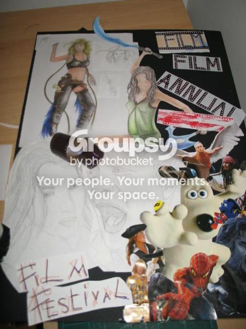
I have pics of my preparatory sheet, we bring this in with us and use it to base our final piece on.

IMG_0902.jpg
this was my prep sheet.

IMG_0900.jpg
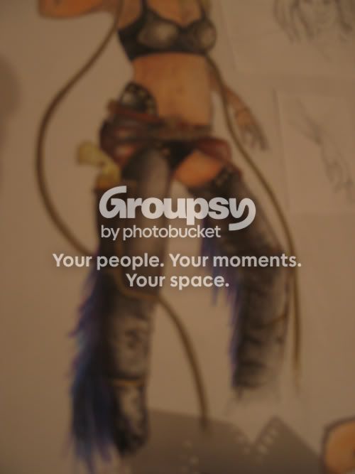
and these are Jessica Alba's legs, lol. I just thought they turned out quite well! 🙂

So thanks for your advice guys, I'll go prepare for my Life-Drawing and Still life exam(Also an 5 hour exam) for tomorrow 🙂
 
Whoa, that's quite something BEG. I like the pencil sketchwork, very nice.

It is weird having an "exam" for art classes, I can recall a few. Mostly really fun...
 
Black Eye Guy
Black Eye Guy
Yeah they are fun, when you are on top of everything :)
Back
Top Bottom