Assignment for *Charmed Slayer* and Wicked: Comics Styles.

Old Master 3.0

Watchers Council
Watcher
Joined
Nov 18, 2003
Messages
6,247
Age
59
Location
New York City.
Black Thorn
Howdy girls. :: tu ::

The two of you are very good at making graphics look almost like comics art. We would like you two to workshop some graphics using that particular style. Here is the request from N4H:

"We'll need graphics for our story links. They should be about the size of what you see for the Whedonverse, Firefly, and Comics forums on the Buffy-Boards home page. For starters we'll need a graphic for Faith, one for Kendra, one for Kakistos, one for The Master, and one for Giles and the White hats."

Show 'em what you're made of, ladies. :: tu ::
 
omg lol.. okay... I'll do one of each over the next few days.

"They should be about the size of what you see for the Whedonverse, Firefly, and Comics forums on the Buffy-Boards home page"

what you mean.... like the top header or the little square ones... im sorry.. another blonde day *blushes* ill get started finding some good pics whilst i wait for a response 🙂
xx
 
what you mean.... like the top header or the little square ones... im sorry.. another blonde day *blushes* ill get started finding some good pics whilst i wait for a response 🙂
xx


Lol, don't worry about it. They should be the size of the square graphics that head each forum on the home page, yes.
 
so how many pixels you reckon... it would make it heaps easy if i knew!! ta xx

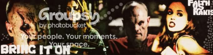
EDIT: i just made this as a practise/demo sorta thing.. is this sorta the thing you are wanting... i know you want seperate ones for each character but.. you get me! :silly:
faithandkakistos.jpg
 
Your sample is nice CS, but not exactly what we're looking for.

Give this a try....take the one pic of Faith on the right hand side of the banner, and make something about 125px by 125px. Put a grey background on it, and leave the words out. Also try it at 150 X 150.

Thanks. :: tu ::
 
ok i get you now... 🙂 But is that the comic effect you were thinking of? That was just a sample I did a while back
 
I'll have to take the blame for not explaining it more clearly. Sorry, my bad. 😛

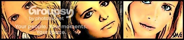
What I meant by comics-style was the effect you and Wicked add to some of your art to make it look like comic book art....like you did in this Buffy banner you made a long while back:


iLOVESARAHBANNER2hfgh.jpg
 
oh my god.... *Gah* get rid of that! lol.. no i get you!!! lol.. ill do one... and see if you like it and its what you want.. Ill do the rest xx
 
Old Master 3.0
Old Master 3.0
What? You don't like your own banner? Lol.
Kind of like this one I made a while back? The background ones obviously.

mysterious-006-esther.jpg


Another question. When you say the White Hats, does that men Giles, Oz, Larry and Nancy from the Wish?

Ok (sorry for hogging the thread 🙂)

These are a few I did really quickly. If its the kind of thing youre looking for, I'll do them a bit better. Just let me know what to change 🙂


themaster.jpg


kendra.jpg


kakistos.jpg


faith.jpg
 
Z
zombie.apparatus
yeah thats what he means :D I like this.. I havent seen this before :D xx
nerd4hire
nerd4hire
I like the Kakistos one best.
^ Yes, excellent...that's what we need, girls. Show us more of that. :: tu ::

Wicked, this is yours and CS's thread. Don't worry about hogging anything, speak whatever is on your mind, dammit! 😛

As for your White Hats question....yes, we are talking about that entire Giles group from The Wish.

Also, in addition to the 125 x 125px and the 150 x 150px, could you guys also try 190 x 110px? That's the size of the link pics from the BB's home page. We just want to see how these things look in the different sizes.

Appreciated. :: tu ::
 
Hi:

I'm in the neighborhood, and feel inspired to drop in with some feedback.

We're trying to figure out how best to organize an index page. I'm really enjoying the unique possibillities you guys are presenting for the avatar style graphics.

Charmed Slayer, I really like that one Faith pic on the far right of the banner up there. I think when you present it avatar style it's going to be real clickable.

Wicked, I love that Kakistos one - so sinister. Is it possible to take the blotches out of the good guys faces, so we can see what it looks like with a clear distinction between good guys and bad guys? Could we see another one of The Master with his full head?
 
I should be able to do that, yeah 🙂 I just did those ones really quickly to see if thats what you were looking for 🙂
 
Ok ... these are all 125x125.. some of them I think are one pixel off.. but here.. is this what you sort of had in mind?

5.jpg
1-1.jpg
4.jpg
3-1.jpg
2.jpg
 
Ok, so attempt number 2. In both 150x150 and 125x125

I tried 190x110 but the only one that worked was the White Hats one because the others all went out of proportion and looked squished


faith150x150.jpg

faith125x125.jpg


kakistos125x125.jpg

kakistos150x150.jpg


kendra125x125.jpg

kendra150x150.jpg


themaster125x125.jpg

themaster150x150.jpg


whitehats125x125.jpg

whitehats150x150.jpg

whitehats190x110.jpg
 
Okay, this is good stuff, girls. We'll forget the 190x110 for right now, as it's tougher to manage.

I'm thinking we keep these from CS:

5.jpg
1-1.jpg
3-1.jpg


And I like Wicked's versions of Kakistos:

kakistos.jpg
kakistos125x125.jpg


Wicked....your 150x150 version of the White Hats is a good size for our purposes. Let's keep that one. Is there any way to sharpen up the lines like you did with your Kakistos one?

Also, the dark borders that are around some of these pictures is a nice touch. I'm thinking all of the final work should have the bordering.

Thank you so much for the work you guys are doing. :: tu ::
 
The White hats one was a bit harder because of its size and the quality of picture but I can give it a go tomorrow and see what i can do. I thought you might need borders but I left them off mine cos I wasnt sure. But I can add them too 🙂
 
Back
Top Bottom