

You are using an out of date browser. It may not display this or other websites correctly.
You should upgrade or use an alternative browser.
You should upgrade or use an alternative browser.
Bluebird's Art
- Thread starter Bluebird
- Start date
Lindsey McDonald
Spirit Boy
O.O
Stop making me think of Dawn and Connor like that!
STOP IT!
Stop making me think of Dawn and Connor like that!
STOP IT!

Bluebird
Me? You're the one with the dirty mind. (sw)

Bluebird
two by two, hands of blue
- Joined
- May 17, 2008
- Messages
- 6,416




Friendly Lurker
The Spuffy sig is awesome! I heard the guy who you made it for is too.
L
LorneyTunes
well tell me whos gay am waiting! nice work
Aly Fan
MeowCluck!

Friendly Lurker
Scooby
LorneyTunes
I've been forking!

I leave you this dance of joy ! because your art is great and am impressed keep it up ! ILY
Friendly Lurker
I love her more!
Lou
Scooby


definition of insane
Hostile 17
Friendly Lurker
Scooby

Washburne
Protector of the key.
Friendly Lurker said:I love her more!
Lou said:I love her more!
Guys, guys. I hate to state the obvious but you know the truth. 😉
I'm not totally convinced it's appropiate for me to say anything about that...Bluebird said:yay for penis (sw)
Oh, eh, ah, yes the art. It's all great obviously. :tongue:
Bluebird
(hm)

Angelic Slayer
Daydream Believer
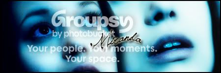
Oh wow! Simple, dreamy and beautiful! The blue overlay really made the actress' features pop, and the name is a really pretty text. I love it, can't believe how quickly you're improving! You, my dear, are nuts (in a good way, don't worry!) 😀
Keep it up! I'll be watching for more :thumbsup:
Keep it up! I'll be watching for more :thumbsup:
Bluebird
thanks! :D
Bluebird
two by two, hands of blue
- Joined
- May 17, 2008
- Messages
- 6,416

Friendly Lurker
Scooby
P
Perny
Guest
^I second that!!!!
Or some Vahla Ha'nesh/Illyria banners in the good spirit of our house
Or some Vahla Ha'nesh/Illyria banners in the good spirit of our house
F
Fake Shemp
/me wholeheartidly agrees
Bluebird
two by two, hands of blue
- Joined
- May 17, 2008
- Messages
- 6,416
A Charisma one. Might be too bright.

Andy. 🙁

And for Perny. (sw)

Andy. 🙁
And for Perny. (sw)
Friendly Lurker
Purties! Still needs more Spuffy though. (sw)

Angelic Slayer
Don't listen to these guys, Bangel is the only way to go ;)
Angelic Slayer
Daydream Believer
Charisma:
I don't think it's too bright at all hun. The photos have enough contrast that you can actually get away with that brightness. And I'm not sure how you did it, but in the middle photo her hair and features stand out just that little bit more. That really gave the banner focus, great idea!
Andy:
Wow. I'd totally forgotten about that scene, it means so much more now that he's gone. Great tribute. I might have done somehting to have the text stand out a little bit more, but really it's awesome.
And yay for the Illyria banner! I love the effect you used on Illyria (whatever it is!) and the font colour matches to a "tee!" 😀
Great work m'dear, can't wait to see more!
I don't think it's too bright at all hun. The photos have enough contrast that you can actually get away with that brightness. And I'm not sure how you did it, but in the middle photo her hair and features stand out just that little bit more. That really gave the banner focus, great idea!
Andy:
Wow. I'd totally forgotten about that scene, it means so much more now that he's gone. Great tribute. I might have done somehting to have the text stand out a little bit more, but really it's awesome.
And yay for the Illyria banner! I love the effect you used on Illyria (whatever it is!) and the font colour matches to a "tee!" 😀
Great work m'dear, can't wait to see more!
Bluebird
Aw, thankies!