

You are using an out of date browser. It may not display this or other websites correctly.
You should upgrade or use an alternative browser.
You should upgrade or use an alternative browser.
Cait's Project
- Thread starter caitaintdead
- Start date
- Status
- Not open for further replies.
dan k
Bangel Is Eternal
The "Dum Dum De Dum" banner is epic. LOL
I just understood the reference of "Dum Dum De Dum" to this episode. :biggrin3:


caitaintdead
caiters gonna cait
The I In Team

Goodbye Iowa
---------- Post added at 12:51 PM ---------- Previous post was at 12:50 PM ----------
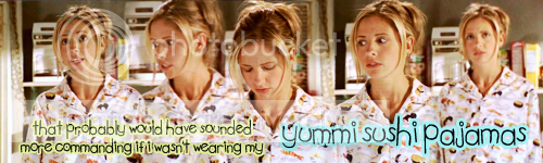
Oh penis. I really wish I had sharpened that last Buffy pic on Goodbye Iowa 🙁 I was to distracted by the yummi sushi!
Goodbye Iowa
---------- Post added at 12:51 PM ---------- Previous post was at 12:50 PM ----------
Oh penis. I really wish I had sharpened that last Buffy pic on Goodbye Iowa 🙁 I was to distracted by the yummi sushi!
M
Marisa
those are all nice :)

Taake
Sushi PJ karma! (the I in team one is HOT!)
msfantastico87
Joann the Goblin Slayer
love, love, LOVE the sushi pajamas banner!!!!
as for the Buffy and Riley one, it looks nice, but I hate Riley lol, but it still looks great
as for the Buffy and Riley one, it looks nice, but I hate Riley lol, but it still looks great

caitaintdead
Haha thanks! I had a inkling that the Briley piece wouldn't go down so well with the majority!!

Damn it. I always get so annoyed when I see brilliant banners that I wish I had thought of myself.
Think it happens more often with your banners because you pick different scenes than the usual.
This time it's the sushi pajamas one. Love that pajamas. 🙂
The same goes for the one with Willow, Tara and the Rose earlier.
Really like what you did there.
/SK
Think it happens more often with your banners because you pick different scenes than the usual.
This time it's the sushi pajamas one. Love that pajamas. 🙂
The same goes for the one with Willow, Tara and the Rose earlier.
Really like what you did there.
/SK
caitaintdead
thanks! doing a banner for each project has really helped me stray from the usual banners, it's definitely helped me explore different styles as well.

PrincessBuffy16
Scooby
Awww, Sushi PJ one is so cute. I've always loved that scene! ^^
caitaintdead
Yay for sushi pajamas! Thanks!
dan k
Bangel Is Eternal
Sarah looks stunning in both banners and i like how you've used 5 Sarah's in one banner and all of them fit nicely.:smile3:
caitaintdead
Thanks!

Connor Holtz
Jasmine's Champion
Hey Cait, I was just wondering if you were going to branch out into ANGEL for this project? I think, wait, I know, you would do ANGEL's episodes some wonderful justice. I really hope you do... 😀
caitaintdead
Yeah, I'm thinking about doing Angel as well but I'm going to try and make it through Buffy first! I'm glad you like!

ItMustBeBunnies
Bugger off, you brolly!
Haha, love the Goodbye Iowa banner! Great work Cait! 😀
caitaintdead
Thanks bunnies!
B
Big Damn Hero
I love your banner!
faeriegrrl27
Resident Jew

Willow Rosenberg
I might be just like you!
Great stuff, like someone else said, it's great to see banners that don't feature the usual scenes! 😀 I like your style, your blending is pretty fab too. 🙂
Do you ever use gradients & other filters at all, if you like trying new things? 🙂
---------- Post added at 11:51 AM ---------- Previous post was at 11:34 AM ----------
What program do you use? 🙂 I work in Photoshop CS3, and I would point you to my site which has some tutorials on it, but it's offline at the moment. But if I can help then I will. 😀
Do you ever use gradients & other filters at all, if you like trying new things? 🙂
---------- Post added at 11:51 AM ---------- Previous post was at 11:34 AM ----------
caitaintdead agrees: No, I've never really figured out what gradients and filters are/how to use them! Definitely would love to learn though if you have any advice!
What program do you use? 🙂 I work in Photoshop CS3, and I would point you to my site which has some tutorials on it, but it's offline at the moment. But if I can help then I will. 😀
caitaintdead
No, I've never really figured out what gradients and filters are/how to use them! Definitely would love to learn though if you have any advice!
caitaintdead
caiters gonna cait
Willow Rosenberg
I might be just like you!
Aw fab 😀 That makes things sooo much easier as my tuts were done for that lol 🙂
I *think* I still have my art thread in here...somewhere, so what I'll do I'll post one of the tuts for you take a look at. See what you think. 🙂 Unless of course you already have seen it, because it is staked in here, but the links are down atm, it was the one how to get this effect:-
Michelle T - Filter effect
I *think* I still have my art thread in here...somewhere, so what I'll do I'll post one of the tuts for you take a look at. See what you think. 🙂 Unless of course you already have seen it, because it is staked in here, but the links are down atm, it was the one how to get this effect:-
Michelle T - Filter effect
caitaintdead
caiters gonna cait
Thanks Marisa for linking me the manip tutorial! Next up I'm trying edb's!
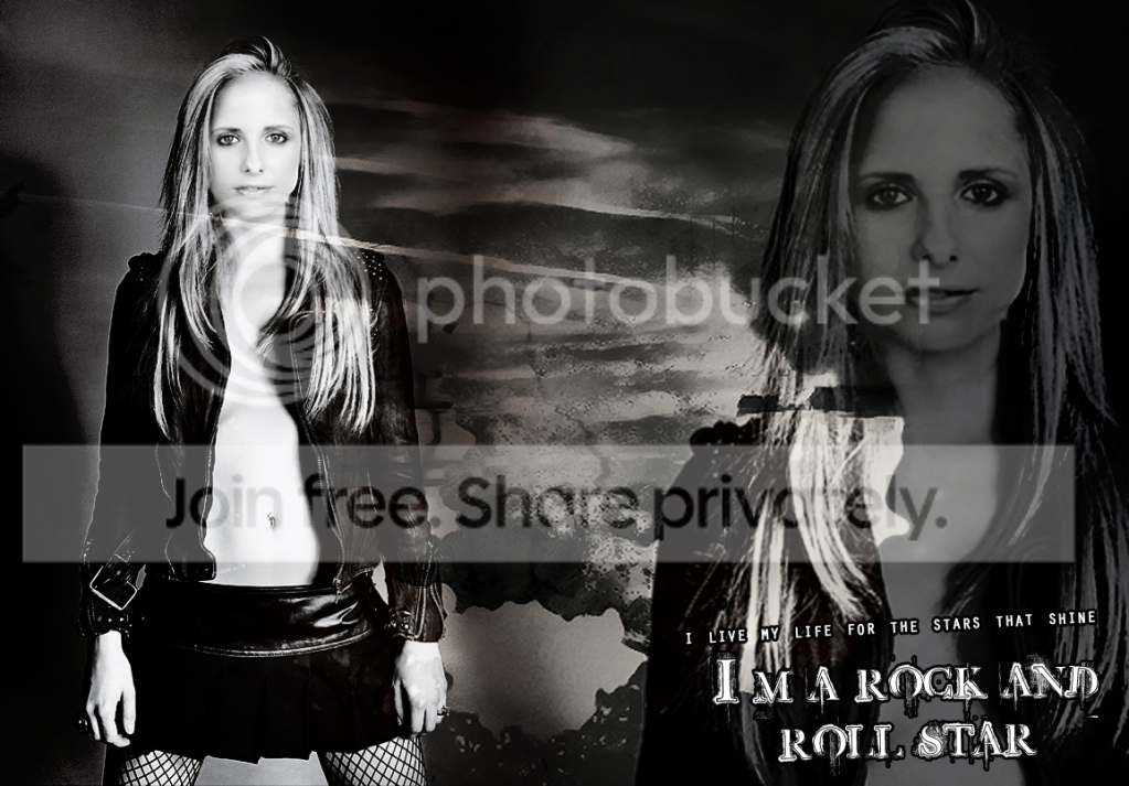
So... Is it okay for a first manip? Any advice always appreciated!
So... Is it okay for a first manip? Any advice always appreciated!

ItMustBeBunnies
Oh, really cool! Especially for your first go!
Willow Rosenberg
I might be just like you!
Really love that, for a first attempt - amazing! 😀 I'd say only teeny weeny thing is the hair line...it's a little far back for her head, but that's only the teensiest detail I would change! 😀 Love the composition, the 'grungey' feel too it!:: tu ::
PrincessBuffy16
Scooby
dan k
Bangel Is Eternal
I can't really give advice because i know next to nothing about design but it looks really good. The texture, colour, shade all complement Sarah really well. :smile3:
caitaintdead
caiters gonna cait
Okay, back to The Project.
This Years Girl

Who Are You
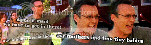
I'm pretty happy with how both of these turned out. I can't help but use gritty, grungy textures for Faith. It seems to suit her really well. And the Giles scene is absolutely hysterical, I almost forgot about it and did one of the usual scenes, but I'm really glad I remember the Giles dramatic funniness!
This Years Girl
Who Are You
I'm pretty happy with how both of these turned out. I can't help but use gritty, grungy textures for Faith. It seems to suit her really well. And the Giles scene is absolutely hysterical, I almost forgot about it and did one of the usual scenes, but I'm really glad I remember the Giles dramatic funniness!

Connor Holtz
Karma for yet another stunning Faith banner! <3
Connor Holtz
Jasmine's Champion
You're right, it suits her well.... awesome banner of Faith as usual. And I like the Giles on as well. "Dammit man.... our mothers and tiny, tiny babies!" LMAO
caitaintdead
I was thinking of you the entire time I made the Faith Harlot banner! Thanks for the compliments!
- Status
- Not open for further replies.