Enter this thread at your own risk....Av's art attack

Status
Not open for further replies.
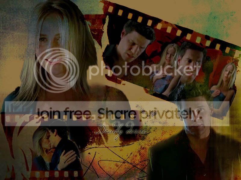
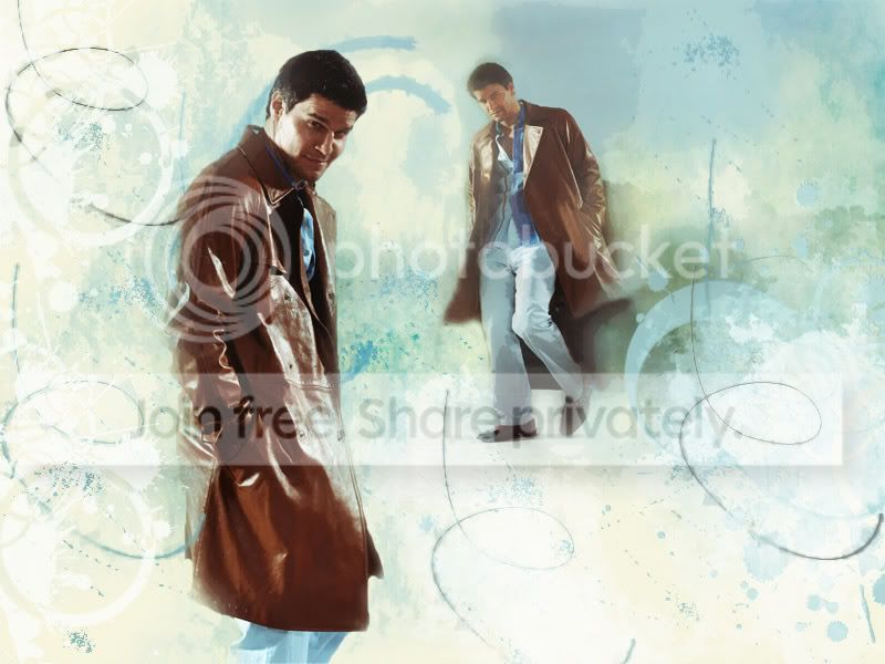
DBvintagewall.jpg
 
Angelic Slayer
Angelic Slayer
Awesome banner!!! Can't believe how clear it is! Seemless
palabravampiress
palabravampiress
^ What she said.
More really awesome stuff, you're really growing with every post hun!

DB Background: Okay, so you already know how much I love this one, but I really have to say it again! The blends were just right (as were the size of each picture), and I don't know what texture or colour scheme you used but it really compliments the photos. And the caption ties it all in nicely: a very well rounded piece. One of my faves for sure 😀

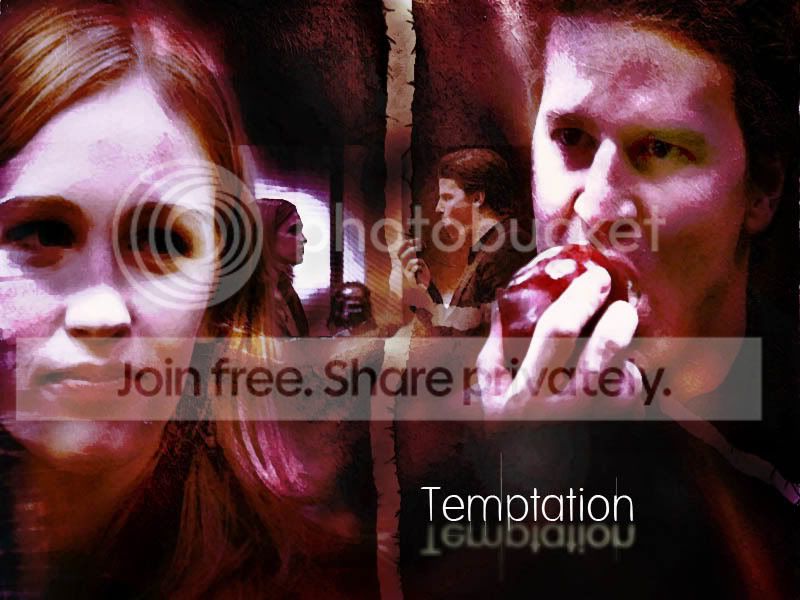
Darla/Angel: Not a huge Dangel shipper, but another nice background all the same. I definitely liked those film strips you threw in there (very crafty!), and the grungy effect REALLY suits the BG. And again, great choice in textures and such, you really seem to think about the "big picture" when you're doing these.


The only thing I may suggest is that you watch out when you're resizing photos that they stay in their original preportions (so an 800 x 600 piece made smaller could be say 400 X 300). It's not a huge thing, I just know when I make banners I find it can really add to the overall appearance if you try to keep the character in the same preportions that you're used to seeing them in (so just making sure that pictures, especially of faces, aren't stretched out too much). Again, just a suggestion! Not a huge issue obviously! 🙂

But again, awesome stuff! I really hope you put up more soon! I can't wait to see more! 😀
 
A
Angel's vision
Bre is the lady who's texture I used for the Darla/Angel one, Shadow of the day texture for the DB one, though I made sure it was barely there, as to not move away from Nikki's grunge brushes, I'm sure I used another's but I can't remember where!
SMGbanneravart.jpg


AHbanner.jpg


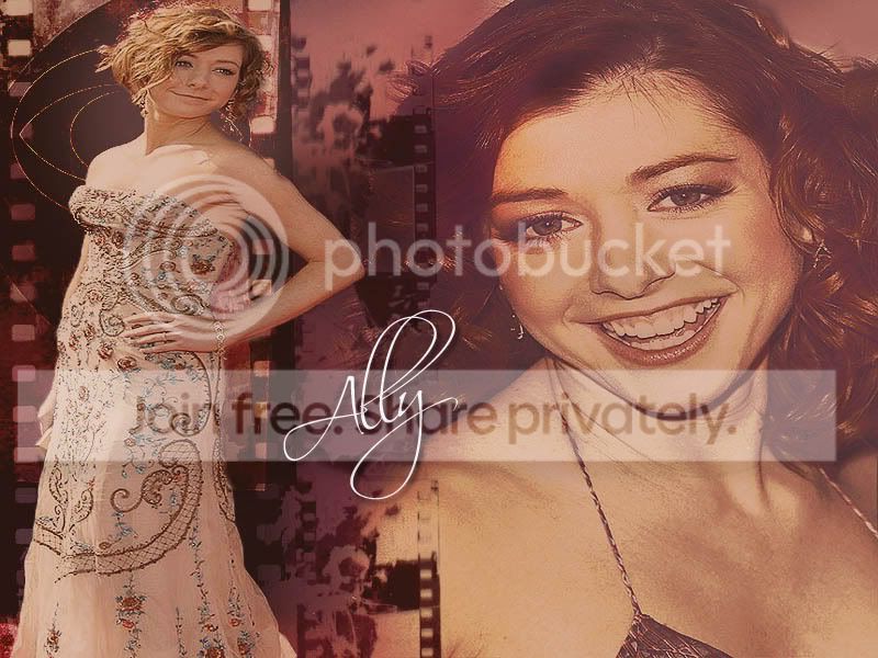
Allysonwallie.jpg


I was going to say in regards to the pixels and size, the trouble was the pictures I used for the film strip were pixelated, so I tried to shrink them without causing too much hastle with them, and placing them so they co-inside with the angel of the brushes is not easy, I should of placed them first before the brush me thinks!
The brushes of film are from brusheasy, BTW. Meanwhile I made two banners and a wallpaper^^^
 
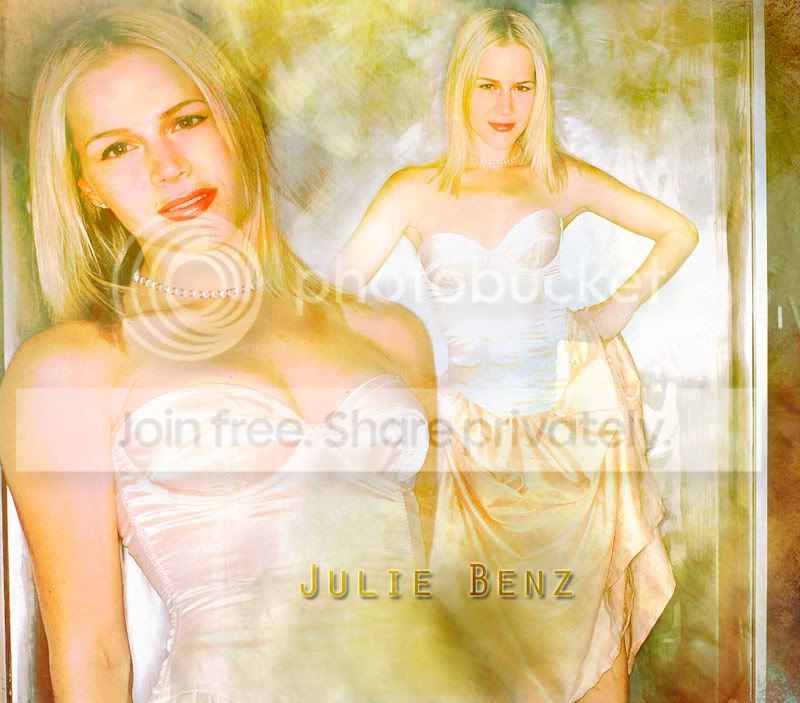
JBwallie.jpg
Shattered texture and Gradient by Missplaced.

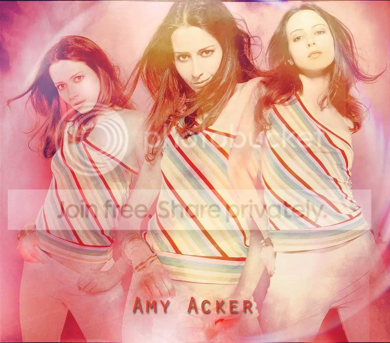
AAwallie.jpg
Textures by Shattered, and Gradient by SoTd.Texture 2 by Zugma.
 
Willow Rosenberg
Willow Rosenberg
Oops....never noticed my typo, or maybe I was distracted by the gorgeous Db, eh! ;) 'lol'
Really fab new pieces hon, you're definitely getting the hang of CS3 I see! 😀 I love the 'Wintage Man' piec especially, it has gorgeous colours and textures! 😀
 
A
Angel's vision
LOL It's "Vintage man" Thanks hon, there are elements of cs3 that still elude me but it is fab for blends
Very lovely textures!!! I would love to learn how to use textures... I don't quite know how... any takers to teach me?
 
A
Angel's vision
You basically place them onto your art and set the rubber to what ever opacity you want and rub away, if you have ps pscs you have a blend option where you can blend the texture in soft, linear,or hard light etc
That new piece is really beautiful, gorgeous colours, and I really like the filters you've used, subtle but enough of a difference to see the effect! 😀 FAB work! 🙂
 
A
Angel's vision
Thanks! using layers really does enable one to blend the filters to how much you want them to be
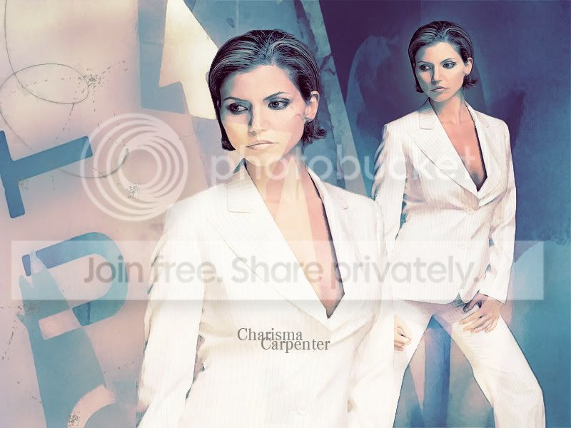
CCwallie.jpg


If only screen-caps were this good a quality^ to get the above result! anyway some Charisma goodness for now

Gradients: Misplaced.
Texture: Intoxicated, EDB's hubby, site.
 
Status
Not open for further replies.
Back
Top Bottom