
You are using an out of date browser. It may not display this or other websites correctly.
You should upgrade or use an alternative browser.
You should upgrade or use an alternative browser.
MSchett's Galleria
- Thread starter MSchett
- Start date

Blondie Bear
Zydrate Addict
*jawdrop*
I'm no expert, but I like it a lot. The only thing I might do different is to not cut off that bit of Spike's face that got left off. It's just a bit jarring. Otherwise, I think it's great.
I'm no expert, but I like it a lot. The only thing I might do different is to not cut off that bit of Spike's face that got left off. It's just a bit jarring. Otherwise, I think it's great.
Lindsey McDonald
Spirit Boy
Another thing, make with the subtlety when putting your name on. Unless your name is the focus of the sig it can be distracting. I like to put mine semi-transparent too. It means that it doesn't distract from the great images! Really good, especially for a first attempt! Well done. What program do you use?
Oh, and don't look to hard for a ridiculously transparent version of my name somewhere in my current sig; I forgot to add it this time!
Oh, and don't look to hard for a ridiculously transparent version of my name somewhere in my current sig; I forgot to add it this time!
A
Aethra
I should have read your entire post, I'll admit... *curses* there's a few seconds of my life I'll never get back.
Fake Shemp
VH Hero
lol i was just doing that, looking for your name in your sig.
and as for mschett i love the pics you've chosen, maybe have a faded buffy face between them instead of the angelus face... just a random thought.
and as for mschett i love the pics you've chosen, maybe have a faded buffy face between them instead of the angelus face... just a random thought.
thx i have photoplus 6.0 its kinda bad not that many features but it came with my computer 🙂
yeah ill make sure to hid the name better but for some reason my fonts wouldnt go any smaller then that
yeah couldnt find any full face up close pics of spike it was annoying but ty loads
[br][/br]
Edit:
[br][/br]
o and can anyone tell me where to find a good selection of buffyverse pics cuz i just used google pics for this and thats how i ended up with a cutoff spike 🙁
yeah ill make sure to hid the name better but for some reason my fonts wouldnt go any smaller then that
yeah couldnt find any full face up close pics of spike it was annoying but ty loads
[br][/br]
Edit:
[br][/br]
o and can anyone tell me where to find a good selection of buffyverse pics cuz i just used google pics for this and thats how i ended up with a cutoff spike 🙁
C
Crazy Flakes
Check out edb's Artist Resource thread. It's staked :D


Willow Rosenberg
I might be just like you!
Nice! I like the faded vamp face on the first, they all look good though. 🙂
PS: I've also merged this thread with your existing thread. 😉
PS: I've also merged this thread with your existing thread. 😉


Willow Rosenberg
I might be just like you!
Love the 2 new banners, especially the Spuffy Vs Bangel, as Aethra said, appropriate for the amount of Bangel Vs Spuffy debates we have on here! 'lol' I really love the film reel effect, it works well! 😀


Lindsey McDonald
Spirit Boy
I love the Fanged Four one! Always liked the flashbacks. Can I ask where you get your screencaps from. You said you got the first ones by doing a google search, and if that is what you are still doing, perhaps you should check out screencap-paradise.com. It's a great site with really good (big) screencaps for every ep of Buffy and Angel.
1 More banner
gotta a new one

a ship that shoulda happened 😉
gotta a new one
a ship that shoulda happened 😉

Willow Rosenberg
Ah...that would be why I can't see them then 'lol'
gotta a new one
a ship that shoulda happened 😉
Very dramatic... I like it!
Lindsey McDonald
Spirit Boy
Willow Rosenberg
I might be just like you!
Really like the new ones. 🙂 I love the Fangel one although it's a tad dark for me to see the images on either side clearly - might just be my screen though. 😉
A tip (being as though you asked for any tips ) you may find usedful for lightening caps that you do find that are too dark, is to duplicate the layer and put the top layer on screen - usually this will lighten a screencap quite a bit, or alternatively create a new layer and fill with a soft creamy colour and set the layer mode to soft light.
Like this cap :-
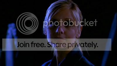
And then, duplicating the image, & putting the top one on screen:-
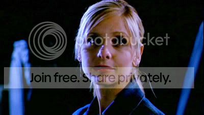
As you can see, it has lightened the screencap up. 🙂 There are quite a few alternatives to lighten caps other than this though. Just thought you may find it useful when making sigs from caps. 🙂
A tip (being as though you asked for any tips ) you may find usedful for lightening caps that you do find that are too dark, is to duplicate the layer and put the top layer on screen - usually this will lighten a screencap quite a bit, or alternatively create a new layer and fill with a soft creamy colour and set the layer mode to soft light.
Like this cap :-
And then, duplicating the image, & putting the top one on screen:-
As you can see, it has lightened the screencap up. 🙂 There are quite a few alternatives to lighten caps other than this though. Just thought you may find it useful when making sigs from caps. 🙂


