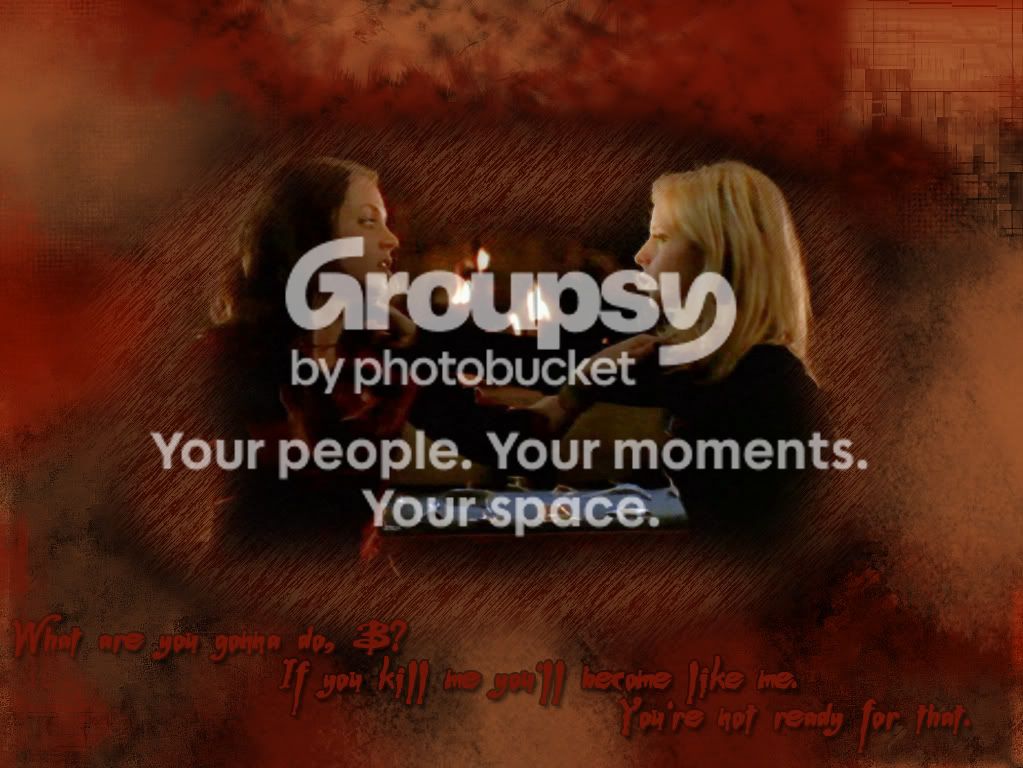
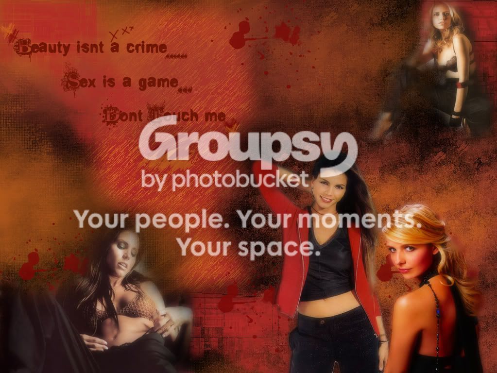
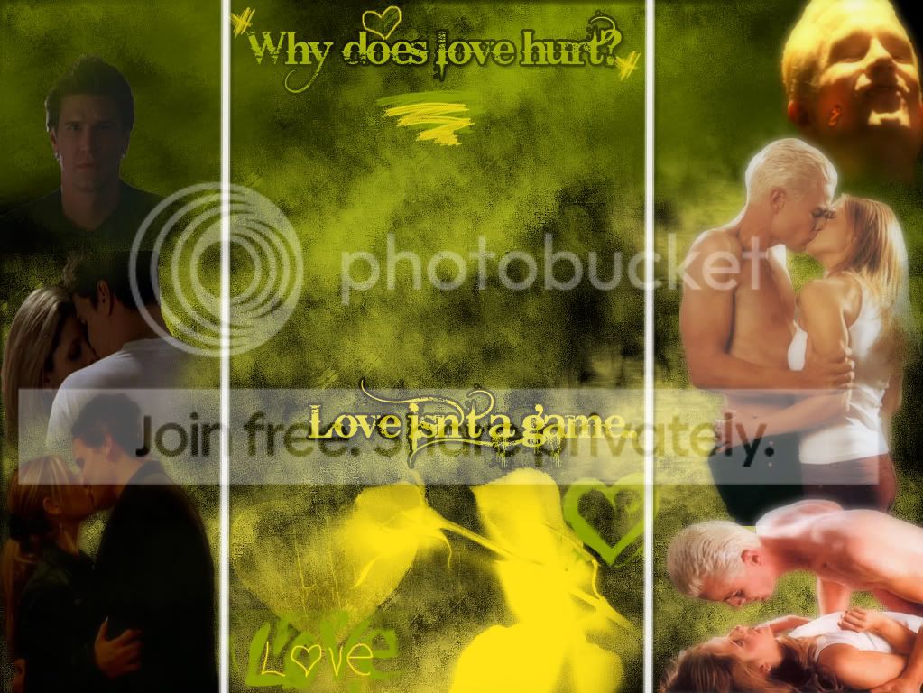
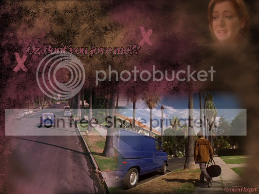
You certainly are getting better. Keep up the good work 😉
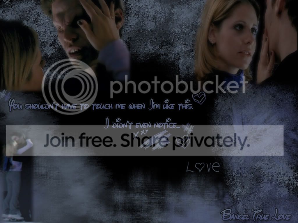
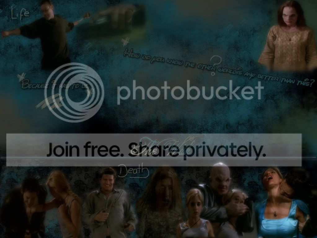
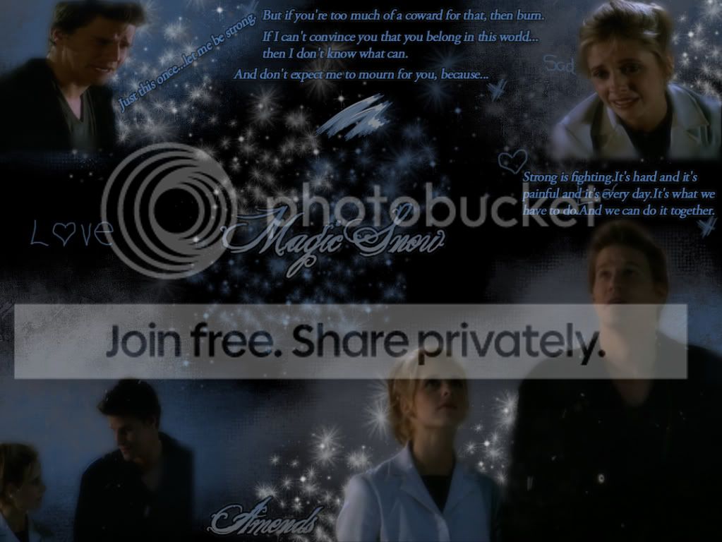
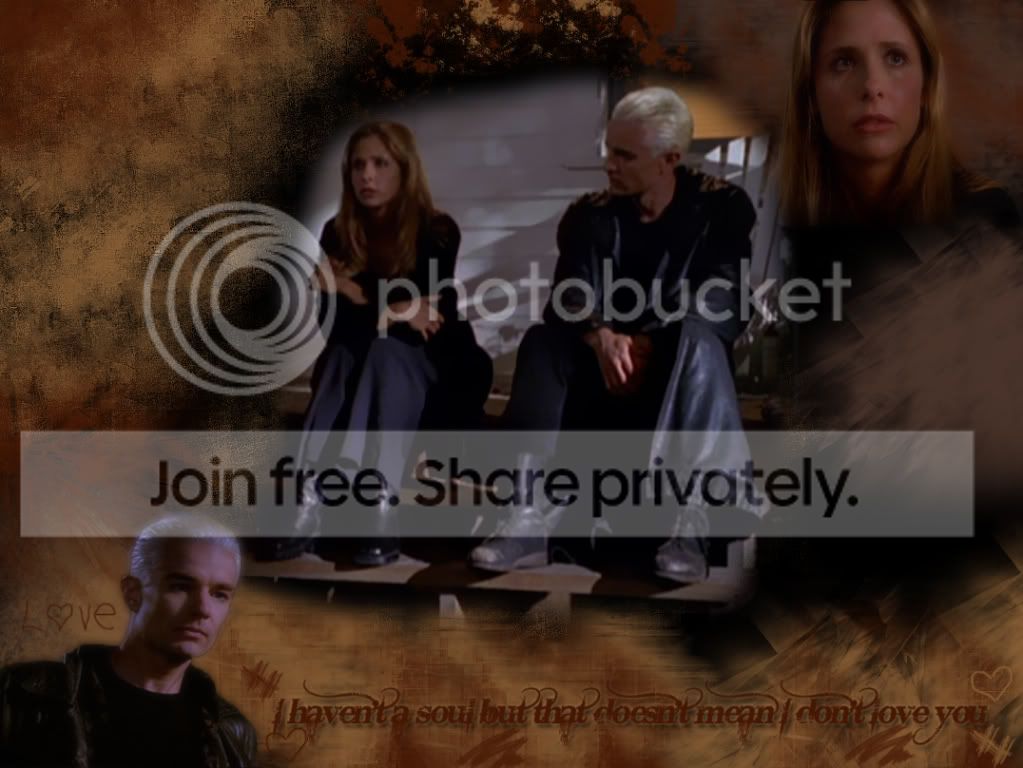
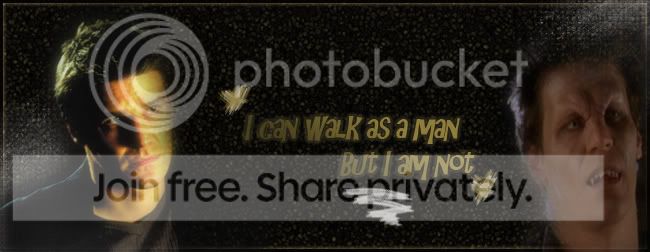
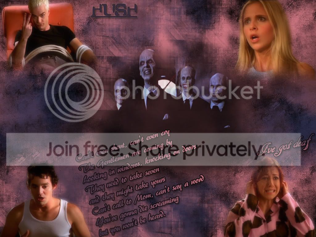
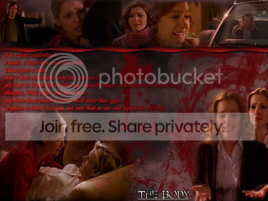
A little suggestion though, try to blend the typography a little more with your images. By this I mean, sometimes the words are like flying around in the space, maybe what you can do is to start and use a little bit more of miscellanea, like arrows, or stripes, something that will help to give the fonts that you're using a character, just as much as the images.
A little suggestion though, try to blend the typography a little more with your images. By this I mean, sometimes the words are like flying around in the space, maybe what you can do is to start and use a little bit more of miscellanea, like arrows, or stripes, something that will help to give the fonts that you're using a character, just as much as the images.
W
WaLkiM
Hmm...Thanks for your idea :)