What Makes "Bad" Art?

nerd4hire

Certified Uncloneable
Joined
Nov 13, 2002
Messages
9,102
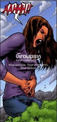
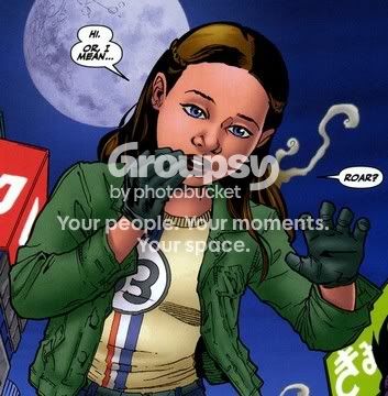
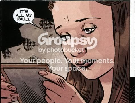
On these boards at least, Karl Moline has received critique for what's referred to as bad art in the Time of Your Life arc.

I don't get the criticism myself. It's not sloppy. It's not amateurish. Even if it was, would that necessarily make it bad if it somehow added to the story. I like the Time of Your Life art. So I wonder...what is it about the art, that makes some look at it, and say that's bad, or good, or just OK.

When Cliff Richards was doing the art for Season 8, the majority seemed impressed. The comments suggested there was a belief he'd caught the characters, and by that they appeared to believe the characters in the comics looked like the actors in the TV series. Is that necessarily how we must judge good art in Season 8 though?

Georges Jeanty is kind of off and on with that. All the characters appear to have these kind of rounded Charlie Brownish faces, yet we forgive him. He does other stuff that make the characters breath though, like he gives us interesting background detail and presents the characters in a way which leads to believe he understands them. Does that make his art good though?

The critique I hear against Moline most often is the characters don't look like the characters we think we know. Is that fair? Even assuming the critique reflects some basic truth, in the context of Buffy Season 8, Time of Your Life, does that make the art "bad"?
 
Bad art... there is no such thing.
It depends on the eye that sees...
 
I think the effect is the opposite of book going to movie; when we read a book we love, we picture the characters in our head, yet often when they are cast look nothing like we 'saw' them from the book. In this case, we have seen what the characters should look like, and anything that varies from said look we consider 'bad' in terms of duplicating the original look of the character. Not sure the art could be considered bad, but the replication of the character is what I think people call 'bad art' (typing while on phone, hope that makes sense)
 
When it's comic art, can it be bad, if it doesn't compliment the story? Can some art be better than other art. Is Season 8 art better than After the Fall art, or vice versa?
 
The reason I don't like Moline's art is that I think it looks amature-ish. If the characters are to be excited/upset/scared their eyes are huge and bug-like. And Buffy's mouth is huge in 'Time of Your Life' lol. I much perfer Geroges S8 art. He's by far my favorite as far as capturing the characters goes. He seems to really be able to get the 'character' and not neccesarily the actor, which I think is where some of the other artists fall short.
[br][/br]
Edit:
[br][/br]
Is Season 8 art better than After the Fall art, or vice versa?

Without a shadow of a doubt, yes! A:ATF is sloppy, like the artist can't be bothered after a while. Especially with the women. He concentrats so much on Angel and Spike, Gwen and Nina often look like demented fools.
 
L
Lindsey McDonald
Totally agree. Even though they ARE demented fools most of the time. But that's beside the point!
(is there anyway someone could show the differences to a person that doesnt know one artist from another? put them side by side or somethun? that would be really cool)
[br][/br]
Edit:
[br][/br]
If the characters are to be excited/upset/scared their eyes are huge and bug-like.
Don't laugh because very much illiterate on this stuff (but am learning) but isn't that like a qualification for Japanese Anime? Doesn't it look like that?
 
nerd4hire
nerd4hire
Hang on. I'll look for examples in the Canon thread.
Don't laugh because very much illiterate on this stuff (but am learning) but isn't that like a qualification for Japanese Anime? Doesn't it look like that?


No, it's not like that at all. Anime stuff is smooth, controlled. Moline's art is rough, very hard edged, and lots of quirky expresions.

I'll see if I can pull up some examples of the four different artists.
 
I should be getting the comics soon.. but.. just curious. I did get the Fray already.

edit: removed the snob sounding comments
 
Karl Moline drew the Fray comics.

Okay, here we go:

Geroges Jeanty, majority of S8 (my personal favorite)

s81.jpg


Paul Lee, S8.5 'The Chain'

s82.jpg


Cliff Richards, S8.10 'Anywhere But Here'

s83.jpg


Karl Moline, S8.16-19 'Time of Your Life'

s84.gif


And for comparison purposes:

Franco Urru, Angel: After the Fall

s85.jpg
 
Skanky Vamp
Skanky Vamp
right on..
I
InsaneMystic
thx... longer comment below. ;)
^ Thanks for that comparison. I definitely understand the Angel:ATF criticism now. Who are these strange people? You sure can't tell by looking at the faces, lol!
 
Didnt that Jeanty piece have the big eyes? or are those normal eyes? Okay.. again, I am using terminology that wont fit but the Angel piece look like paint daub whereas the other looks more line art. Argh. You know what I am saying though, right?
 
^ Thanks for that comparison. I definitely understand the Angel:ATF criticism now. Who are these strange people? You sure can't tell by looking at the faces, lol!

LMAO, I remember that cover being published. We were all in here going 'Who the heck is that guy on the back left, beside Gunn?' No one knew who it was.


It's Groo, incase anyone wanted to know, lol
 
LMAO, I remember that cover being published. We were all in here going 'Who the heck is that guy on the back left, beside Gunn?' No one knew who it was.

It's Groo, incase anyone wanted to know, lol
but how could you not know? that's what I dont understand. I saw it for the first time and could deduce. Though Gwen had me stumped for a bit, the hair color didnt look right.
 
Didnt that Jeanty piece have the big eyes? or are those normal eyes?

Those are his normel eyes, and they fit the image, the rest of his art. To me, Moline's eyes, and mouths for that matter, just don't sit with the rest of his drawing. I think he'd be fine, great even, if his facial details were in porportion to the actual face.
 
Skanky Vamp
Skanky Vamp
i am sooo cornfused.. you said that Moline had the bug eyes, but the first image is Jeanty.. so are his buggy too? or am I lost somewhere? maybe i just wait, save what littee smart looking looks I got left
but how could you not know? that's what I dont understand. I saw it for the first time and could deduce. Though Gwen had me stumped for a bit, the hair color didnt look right.

But, this was the first issue Groo had appeared in. If you didn't know who that as, or expected him, could you deduce it was Groo?

The common theory was Lindsey, at the time, if memory serves.
[br][/br]
Edit:
[br][/br]
Going to N4H's images, I'm Cliff Richards has the best image of the actor, his art is the art that most resembles Michelle, Sarah, Iyari, whover, but I'm still thinking that Geroges has the best character art.
 
Do the pencillers always use the same inkers? do they work in tandem always or are they just randomly assigned to one another?
 
As to the Dawn pics n4h posted... while Jeanty's style does look very "cartoony" (hope you know what I mean, lol - I realize it's pretty redundant to call a comic cartoony 😉 ) I think it's the closest to MT of the three pics, by far!
 
scobro agrees: i am sooo cornfused.. you said that Moline had the bug eyes, but the first image is Jeanty.. so are his buggy too?

Like I said, Jeanty's eyes may look large in that image, but they fit with the proportion of the rest of the face. Moline's don't. They just sit there, looking big.

Also, Buffy's being sad and reflective in that scene, and missing 'that sex' so that could explain the large eyes.
 
Skanky Vamp
Skanky Vamp
I found some where she was not missing the sex, and i see your point.
But, this was the first issue Groo had appeared in. If you didn't know who that as, or expected him, could you deduce it was Groo?

Because it was only the "good" guys on the picture.
[br][/br]
Edit:
[br][/br]
Like I said, Jeanty's eyes may look large in that image, but they fit with the proportion of the rest of the face. Moline's don't. They just sit there, looking big.

Also, Buffy's being sad and reflective in that scene, and missing 'that sex' so that could explain the large eyes.
I am googling... thanks everyone for the quick lessons. 🙂
 
Back
Top Bottom