What Makes "Bad" Art?

You could just start HERE in the canon thread, and go through the pages.

Paul Lee is The Chain. Cliff Richards is Anywhere but Here. Karl Moline is Time of Your Life. Georges Jeanty is the rest.

Moline is also Fray, and the Whedon story from Tales of the Slayers. There's examples of those too.
 
FaithGilesNewSlayers.jpg

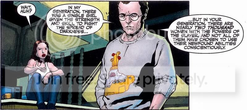
OH MY!!! OOOH MY!!! He has a Beatles Yellow Submarine sweater! hahah
 
I love Jeanty's art. It fits the mood of the arc perfectly, and the characters are instantly recognisable without having to be photo-perfect.

Urru's on the other hand. Well... Fine. Characters are characters, not actors. That, I can live with. But After the Fall was just one big reveal after another. It's a tad problematic when you can't actually tell who the character who's being revealed is. To be perfectly honest, I find it ugly. It's dark, overly shadowed, jagged and eyes just don't look like that. It's distracting. Storys about hell and death are not generally supposed to be accompanied with giggling over how silly Illyria or Nina looks in any given panel.
 
I think all three artists for S8 have done what I would call a "responsible" job illustrating the comics. It's extra-delightful when the characters resemble the actors, but I think that the words are even more important when it comes to keeping the voices of the characters alive in the way they were on TV.

By responsible I mean that they don't deviate wildly from what a human form looks like (believe me, if you ever read old Gen 13 or DV8 comics, you know what I'm saying) and I think they try more often than not to mold their drawings to our beloved actors' faces. I think all three have done a great job conveying meaning through expression and I think that's part of what makes it difficult to make a character look like the actor sometimes - it's hard to replicate how a person raises their eyebrow just so, for example. Also - and this is really important to me - they add important details like the clothing the characters wear or what kind of hair they have that day.

Fortunately, as the literate population grows more and more interested in comic books, we're seeing a rise in comics that don't "cheat out" by having their characters always in the same outfits. You can see this in The Simpsons, for example. But read back about a decade ago, or even less, and characters are depicted in the same, boring superhero jumpsuit they always wear and you have to assume they have one for every day of the week. I love that the trend of paying attention to such details was carried over from the show and I love that the artists actually care. I mean this as no insult to the gentlemen out there, but sometimes you'll see some really blah details from a male artist, because they're concentrating on physical form, not adornment thereof.

I think all three of these guys break that stereotype to pieces and have done great jobs on their runs in the creative team.
 
L
Lindsey McDonald
So, you're saying most of the guys are too busy focusing on Buffy's body to bother with what clothes they're going to draw her in? That's so stereotypical and true. ;)
What initially threw me about Moline's art is that the characters don't much resemble the characters I knew from the show. Jeanty's art isn't always spot-on either, but he manages to capture a lot of the essence of their facial features that make these characters familiar to me - the way a character would look over their shoulder, or sigh, or smile, or show fear, or show anger. These are all things I can conjure images of in my head, from the TV show. So I see the comic and see images of these characters that I know, and I see something familiar about them in the art - it's more than facial features, it's about their expressions, their emotion, their essences - and I connect again.

With Moline, I haven't been able to connect in the same way. But I do like Moline's art. It's very bold, and his inker is bold along with Moline's strong lines. It fits with the Fray world and the older Fray comics. His art is very modern/contemporary and I can tell that he has a strong image in his head of what's going to go on the page.

Given what little I know about comics, his strong artwork would be great for a strong hero feature where the characters and stories are all very bold and in an urban setting. So in my mind, his art fits with the Fray setting.

What would be even better, for me at least, is an artist who drew the characters more lifelike. Someone mentioned the 'cartoony' look of the comics. I've seen some comics that looked so real you could reach in and touch them. I'm sure that takes a lot more time and money to produce, though.
 
I think the problem is we expect all the art inside the comics to be as good as Jo Chen's cover's.

I'm pretty much happy with the art though unless you really can't tell who the character is, for example, Buffy doesn't have to look exactly like SMG, but when you can't tell if someone is supposed to be Buffy or someone else *cough*Time of Your Life part 2*cough* then it's pretty bad.

....Or if it looks like Cliff Richard's art.
 
Back
Top Bottom