
You are using an out of date browser. It may not display this or other websites correctly.
You should upgrade or use an alternative browser.
You should upgrade or use an alternative browser.
Xaphania's Artwork
- Thread starter xaphania
- Start date
- Status
- Not open for further replies.

Sweetescape
Eyeballs to entrails, my sweet.
TheChosenTwo
A Vision of Hotliness
Tasha
Dn'* letthespacebugsbite!
xaphania
Spike/Buffy
I honestly think you're one of the best Buffyverse graphic artists out there! Great stuff!
Aww, thank you so much! There are better people out there than me, but your compliment means a lot!
Awesome stuff! yet again! 😀
Thanks!
Wow, these are really amazing! I'm sure you'll win (sw)
Thanks! Although it's not so much a winning kind of challenge - the idea is artists make banners and post them, and then authors come along and pick a banner to base a fic on. I just hope one of mine gets chosen!
OMg that Fangel one is seexy!
Love it all!
Hee, thanks!
New banner. Yet again for the spuffy_wonder art-to-fic community. Something a little darker this time.

Credits
Buffy - SMG France
Spike - Civilized James
Wounds (on Spike) - trisste-brushes@DA
Cloud Texture - wroth@DA
Room Stock - Saved on my harddrive for ages, no idea where I got it from
Handwriting Texture - by joyfulsong
Various other textures saved to harddrive, creators unkown.
Comments?
U
ubi4soft
vamp!Spike gorgeous (in a creepy way)

MinwaraYana
Countess Von Drunkaton
Sweetescape
Eyeballs to entrails, my sweet.
Awesome 😀,took me a min or so to spot Sarah!. I'd love it if you made tutorials I'm hoping to learn some new tricks 😉
xaphania
Spike/Buffy
Love it. Spike looks 3D. And because I'm sleepy, I somehow see the shadow moving. 😵
Thanks! I wish I could do more than simple animation, because that would be a really cool addition to the banner, if the shadow did move!
Awesome 😀, I'd love it if you made tutorials I'm hoping to learn some new tricks 😉
Thanks! I actually quite like writing tutorials, lol. Is there anything in particular you'd like to see a tutorial of?
Sweetescape
Eyeballs to entrails, my sweet.
Thanks! I actually quite like writing tutorials, lol. Is there anything in particular you'd like to see a tutorial of?
I'm always looking for different colouring techniques, I like how you can bring out colours but it doesn't over power the whole piece. Also how to you get the images so sharp?.
I'm using photoshop CS3, do you use it?.

BuffyElevated
Scooby
xaphania
Spike/Buffy
I'm always looking for different colouring techniques, I like how you can bring out colours but it doesn't over power the whole piece. Also how to you get the images so sharp?.
I'm using photoshop CS3, do you use it?.
I use Corel Paint Shop Pro Photo X2.
For the sharpness - I always try to pick high-quality images to begin with (I don't work well with screencaps) - my program has a tool "One step photo fix" which I generally use on all of my base pics, which helps brighten and sharpen a little. Then, throughout the banner-making process I'll copy merge, sharpen, reduce opacity several times, sometimes erasing parts that look too sharp. If I think it's looking over-sharpened, I'll copy merge and do a "One step noise removal" which smooths everything out, followed by another copy merge+sharpen+reduce opacity. Basically, experiment til I think it looks good, lol.
My colouring is mostly experimentation too, depending on my base pics and the overall feel I want to go for in the banner. I use colour fill layers and adjustment layers (Curves, colour balance, channel mixer etc.) mostly - with some of my program's ready-made tools (eg. sepia toning, film filters, time machine) occasionally. Sometimes textures add colour, too.
Were there any particular banners that I've posted that you want to see how I did the colouring? I save all my .pspimage's so it wouldn't be difficult to write up some colouring 'recipes'.
Oh, that latest one is AWESOME.... WOW!!! That rocks
Thanks so much! 🙂
Sweetescape
Eyeballs to entrails, my sweet.
I use Corel Paint Shop Pro Photo X2.
For the sharpness - I always try to pick high-quality images to begin with (I don't work well with screencaps) - my program has a tool "One step photo fix" which I generally use on all of my base pics, which helps brighten and sharpen a little. Then, throughout the banner-making process I'll copy merge, sharpen, reduce opacity several times, sometimes erasing parts that look too sharp. If I think it's looking over-sharpened, I'll copy merge and do a "One step noise removal" which smooths everything out, followed by another copy merge+sharpen+reduce opacity. Basically, experiment til I think it looks good, lol.
My colouring is mostly experimentation too, depending on my base pics and the overall feel I want to go for in the banner. I use colour fill layers and adjustment layers (Curves, colour balance, channel mixer etc.) mostly - with some of my program's ready-made tools (eg. sepia toning, film filters, time machine) occasionally. Sometimes textures add colour, too.
Were there any particular banners that I've posted that you want to see how I did the colouring? I save all my .pspimage's so it wouldn't be difficult to write up some colouring 'recipes'.
I see, hmm I see what I can find on my photoshop. I know their is a sharpen tool I'll have a play around with it 🙂.
For Colouring I picked out the piece's that I love below 😀. The Journal header is so pretty and perfect for that moment 🙂.
New one made for the spuffy_wonder art to fic challenge. Nothing overly complex here, just a nice simple banner.
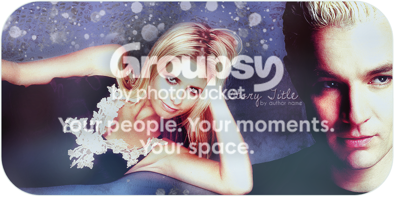
]
I made this the other day, when I felt that a revamp of my LiveJournal was in order.

xaphania
Spike/Buffy
Okay, I wrote up a tutorial for the blue banner. It's long, so I've posted it to my livejournal, link here:
Blue Colouring Tutorial
Blue Colouring Tutorial
W
Willow-Tree
Awesome!

Sweetescape
thanks :D
TheChosenTwo
A Vision of Hotliness
Okay, I could never do that, but thanks anyway 😛
Using one of your banners atm. Hope that's okay 🙂
Using one of your banners atm. Hope that's okay 🙂
xaphania
Spike/Buffy
Okay, I could never do that, but thanks anyway 😛
Using one of your banners atm. Hope that's okay 🙂
I do tend to do a lot of tweaking to all the layers of my artwork, so there are always a lot of steps in my tutorials 😀 I sent you a PM about the banner. 🙂
I haven't had a chance to write up the colouring for the other banner, but I'll do it when I can.
No new art for now, but this is a wallpaper I made a few months ago. Pretty much my second or third time at trying a manip, but I think it turned out okay.

Click for fullsize - 1280x800
Credits
Morgana & Arthur Bases - BBC Merlin Site
Spike - Civilized James
Buffy - Slayerverse Gallery
Some textures I know are from one of the sites in my resource list, but I can't remember which one exactly. Other textures saved to my harddrive, creators unknown.
T
TheChosenTwo
Very cool!
BuffyElevated
Scooby
Wow, very cool! Manips are something I don't do too many of, and it's usually only to "vampify" a character, such as with my Vampire Anya pieces I've done. 🙂 I love the idea of putting a character's head on someone else's body to make a really cool manip though!
Tasha
Dn'* letthespacebugsbite!
xaphania
Spike/Buffy
Thank you! Here's another manip/wallpaper.
I've been wanting to make something with a piratey theme for the past couple of days, so I gave it a go today. Here's Dru as a pirate in a crystal ball. Bit of an odd combo, lol. Also a lot brighter than I'd have thought I'd do a Dru blend. Let me know if it works. 🙂
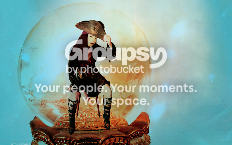
Click for fullsize - 1280x800
Credits
Pirate Base - mizzd-stock@DA
Snowglobe Base - mmp-stock@DA
Drusilla - Slayerverse Gallery
Orange Texture - Shattered
Sunset/Trees - Casperium@DA
Tree/Birds - Flore@DA
Glass Globe - Creator Unknown
I've been wanting to make something with a piratey theme for the past couple of days, so I gave it a go today. Here's Dru as a pirate in a crystal ball. Bit of an odd combo, lol. Also a lot brighter than I'd have thought I'd do a Dru blend. Let me know if it works. 🙂

Click for fullsize - 1280x800
Credits
Pirate Base - mizzd-stock@DA
Snowglobe Base - mmp-stock@DA
Drusilla - Slayerverse Gallery
Orange Texture - Shattered
Sunset/Trees - Casperium@DA
Tree/Birds - Flore@DA
Glass Globe - Creator Unknown
T
TheChosenTwo
Oh, I love that :D

ItMustBeBunnies
That's so cool! Well done:)
BuffyElevated
Scooby
OMG that freakin' ROCKS!! You totally inspire me, girl. I have to try my hand at doing more manips!
- Status
- Not open for further replies.