Help with GIMP?

palabravampiress

Bidet of Evil
Joined
Nov 15, 2007
Messages
3,045
Location
Sunny SoCal
Black Thorn
Hey all.

I woke up this morning and decided to waste some time trying to teach myself how to edit images. I'm a dork and I thought it would be fun to create a banner for my Indra RPG character. Since meeting Spike has caused Indra to start to doubt Dru a little bit, I thought it might be fun to do a banner in which Indra is torn between Drusilla on the one hand and Spike on the other. My plan was to use this little project to teach myself how to use GIMP... but I lack the skills. lol.

Does anyone know where I can find a good GIMP tutorial? The help on the website is... just not working for me.

I want to do something pretty simple: I want to set one image as the background and place another image (an image of the person person) on top as a separate layer. That, I can do. The problem that I'm having is that I'm not sure how to crop negative space out of the top layer so that the background shows through. I thought I could set the lasso tool to the "Subtract from the Current Selection" option, but that just creates white space. I've scoured the internet, but I can't find a tutorial that makes sense to me.

In case I didn't explain it very well, here is the problem that I'm having:
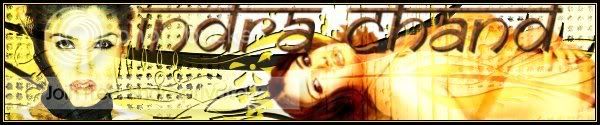
IndraBanner.jpg

See the negative space in the top layer? How do I cut the negative space out so that the background layers shows through?
 
Well, okay...here we go. This might be confusing for those of you who aren't me. Because, well, I'm pretty sure I made this up lol:

You know that bronze coloured background that's behind Indra? Okay, keep that. Then, open a seperate sheet or whatever and click CTRL + L. That'll open up your Layer window. Now, delete the background layer, just get rid of that thing. Then create a new Transparent file. Then, paste your image of Indra on there. Now, go to your Free Select tool and go find where it talks about Feathering images. Check that box and set it to 2.5. Now, zoom in on your Indra image and take out the background manually. It sounds kinda time consuming but once you get the hang of it it's stupidly quick. Now, go back to 100% and go up and find Edit --> Copy Visible. Now go back to your image of your background and paste the image of Indra on there. Now you have no background when it comes to Indra and you can move her wherever you please.

I hope I helped! 😀
- TC
 
palabravampiress
palabravampiress
LOVE the Satsu banner.
Thanks! That was easy.

See? You fixed it.

IndraBanner-1.jpg

I'm gonna keep working on this project so that I can learn more. 🙂
 
The Chosen
The Chosen
:D No problem! Just keep fiddling with it and you'll find its way easier than you once thought!
EDIT: A little while later...

Well, I worked on other things, ate dinner, did some laundry, watched Mr. & Mrs. Smith with my hubby, and now I'm back... and I'm learning! Check it out:

IndraBanner3.jpg

What do you think of the character sizes? I think I need to make Dru a little larger and Spike a little smaller. I tried to make Dru look frail next to Indra and for Spike to be just a tiny bit larger than Indra, but now Spike looks like he's WAY bigger than Dru, and that isn't how they looked on the show. I'm gonna work on that tomorrow night - maybe try to get Spike's hand so that it's touching Indra's shoulder like Dru's hand is touching her face. Right now, it's on her sleeve and it's hard to see.

Now that I've got the concept of layering down, I'm going to play with effects and stuff.

Still, I'm pretty pleased with myself. I've learned a lot in one day.
 
Willow Rosenberg
Willow Rosenberg
You'll be an expert in no time - great job to do that in just one day of using GIMP! :D I hate doing manips!
edb agrees: You'll be an expert in no time - great job to do that in just one day of using GIMP! 😀 I hate doing manips!

Thanks, edb!

I improved the character sizes and the placement of the hands. Now, Spike's hand is reaching out into the foreground and cupping Indra's shoulder while Dru is brushing Indra's cheek and hair. I felt pretty cool doing the thing with Spike's hand. I made a separate layer for it and made it a little larger in order to get it into the foreground. I think it blends in pretty well. Check it out:

IndraBanner4.jpg
 
That works much better PV - it looks great! 😀

I think the hardest thing with manips is getting all the proportions right, that's usually what takes the time - hence why I hate doing them - I have no patience 'lol'
 
That works much better PV - it looks great! 😀

I think the hardest thing with manips is getting all the proportions right, that's usually what takes the time - hence why I hate doing them - I have no patience 'lol'

Thanks!

Before I went to bed last night, I worked on lighting. I'm having a bit of trouble. Does anyone have any tips? I want to play on the way that Indra perceives people as having colors -- the way she sees Spike as being "effulgent" and Dru as being dark. I think I managed the light thing with Spike decently well, but Indra now looks like I cut her out of a magazine and I cannot for the life of me figure out how to get Dru into shadow.

Also, do you guys have any tips for how to make cool backgrounds or sort of blend the foreground into the background better? Mine look pretty bland. Below, I have the lighting effects in the original background, on an Indian-tapestry-inspired background, and on one that I made with the intention of looking like Dru's sewer lair.


IndraBanner5-SewerBackground.jpg


IndraBanner5-KaliBackground.jpg


IndraBanner5.jpg
 
I've never actually used GIMP (I'm a Photoshop CS girl 😉 hehe) so I have no clue how hard it is to use or whether it works in a similar way etc, but for the lighting- and prevention of making Indra looking magazine cut-outish have you tried doing the lighting on Spike first, before adding him to the rest of the picture? That way the effect only effects Spike?
 
I've never actually used GIMP (I'm a Photoshop CS girl 😉 hehe) so I have no clue how hard it is to use or whether it works in a similar way etc, but for the lighting- and prevention of making Indra looking magazine cut-outish have you tried doing the lighting on Spike first, before adding him to the rest of the picture? That way the effect only effects Spike?

Yup. I did that first. Actually, I did Spike's lighting and Indra's lighting on completely separate layers. Ideally, what I want to do is have it looks sort of like Spike is emanating light, which is bouncing off one side of Indra. Then, I want it to look like Dru is emanating darkness, (which is hard to do, since darkness doesn't "emanate") which is bounding off of Indra's other side. I want there to be this whole push/pull thing with Indra caught in the middle.
 
Hmmm...intriguing idea.You could (if it's possible on GIMP) make the light you did on Indra more restricted, so it doesn't spread completely and make it matte and not shine so it does look like it's come off of Spike. As for Dru- try an inner and outer shadow on Dru, and just an inner one on Indra. That might make the darkness look you're going for.
I realize I'm advising you blind here so I apologize. Haha.
 
palabravampiress
palabravampiress
Thanks! I get the Indra/Spike thing and will try that. Still not sure about the shadows, though...
I screwed everything up with the lighting, so I sort of started from scratch -- and made a backup this time. 🙂


I'm still having trouble with the lighting. Here is the manipulation on a plain banner. I added no lighting effects to it:

IndraBannerManip-PlainBackground.jpg

Contrast that with the same manipulation and the same banner, but with lighting effects coming from Spike's side. Specifically, I put points of light behind his head and under his hand.

IndraBannerLighting-PlainBackground.jpg

I think that worked fairly well, but now there's Dru with whom to deal, and this is where I get confused. I can get Dru into shadow. It looks pretty neat. I can't for the life of me, however, figure out how to get that shadow to fall across that side of Indra's face, though. Any ideas?

IndraBannerShadow-PlainBackground.jpg
 
Uh, use your dodge and burn tool. Set it to "Burn" and then check "Fade" and just experiment with wiping it across Indra's face.

🙂
 
palabravampiress
palabravampiress
Thanks, TC! That really helped.
Okay...

So here is the final product of my attempt to teach myself how to use GIMP.

IndraBannerFinal.jpg


What I tried to do was to get it to look like an Indian tapestry. I think I succeeded in every area but the border. I have to work on borders. I had a really hard time with the border, so I finally just gave up and used a ready-made effect. Tips for good border making would definitely be appreciated.

The text was hard, too. I tried to use GIMP, but I eventually gave up and used Word. Then, I just pasted my word art into a GIMP layer. Does anyone have any good tips and tricks for adding text?

Hmm... I just noticed that the text is covering up Spike's hand. I might have to move that text to the other side.

I like the tapestry look, but I do feel bad that the images lost so much of their detail and most of that darn lighting on which I worked so hard. It figures. lol. I might try the same character manipulation with a different theme and background just to see how it would turn out if I did something that allowed for clearer images. Any advice for how to make visually interesting backgrounds and effects without losing sight of the characters in the process?

Thanks in advance for any help you can offer!
 
For text I alwasy go to Xtns --> Logos and just pick one of the several choices. Xtns is located on the main GIMP thing, with all the choices for editing. It's up at the top by "File."

I like your thing, though! Very good for a first piece of GIMPness! 😀
 
palabravampiress
palabravampiress
Okay. I will try the Logo thing. Thanks!
i was gonna give you a tut for a basic border, but the filesize is too big D=

For nice text, install a fancy new font, I recommend Chopin Script, tis very fancy. And of course you'll need the Buffy and Angel fonts 😉

You can get fonts on dafont.com
 
palabravampiress
palabravampiress
Thanks, Clem Rocks! These fonts are cool.
Okay. I haven't installed any fonts yet, so the text is still kind of funky. I tried the logo thing, but I didn't end up doing a very good job.

I did improve the background and the character visibility, though. Compare:
IndraBannerFinal.jpg

IndraBannerTapestry2Final.jpg

All in all, I'm pretty pleased with the result. It looks much more like a tapestry now and you can make out the characters more easily.

Tomorrow, I'll learn how to do the text. 🙂

Thanks for helping me out you guys. It's nice to be able to post questions here and also post images so I can say, "See? I need help with this."
 
That looks really good. And especially for your first attempts; very good! Funky is the word I'd use. 🙂 And you're right; it does have the tapestry look going on.
 
I got bored with the banner and decided to try something different in my quest to learn GIMP.

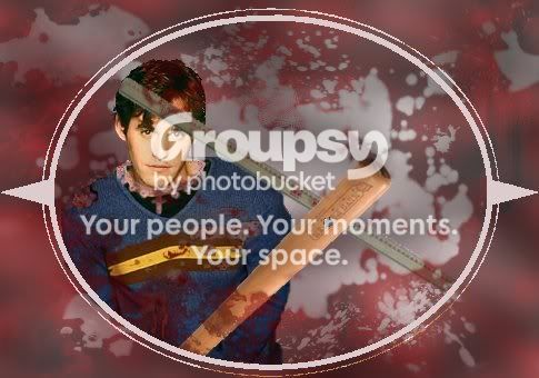
I haven't yet found an artist for my Wishverse story. I did have some art ideas, though, so I used them to come up with the following:

XanderWishverseExample.jpg

This was tough. I had to experiment with all kinds of new tools. I used filters and blurs and colorization and scaling and rotating and all sorts of crazy crap. lol.

There are, however, some things that I couldn't quite figure out:

1. First of all, I'm really pleased with the way I managed to make a visually interesting background for the piece. I struggled with that with the banner. I do feel, however, that Xander needs a background -- like a setting -- inside the little frame thingie. Does anyone have any advice about how to go about doing that?

2. Colorization is hard! I especially struggled with the blood splatters, which I didn't want to be quite as dark red as they ended up being. My solution to this was to apply a blush lower layer and then to make the bloody background more transparent, but I don't think it worked out too well. Any advice on how to do that?

While we're on the subject, I'd like to tone Xander down a bit. He's a little too brightly colored. How can I tone him down a tad without washing him out completely or distorting him too much?

3. While we're on the subject of backgrounds, does anyone know how to make a convincing puddle or watery or other kind of liquid effect? I ended up beginning with a red gradient and using some cloud distorts and some blurs to get something sort of resembling a puddle. After that, I used blood brushes to add/subtract splotchiness as needed.

4. Detail work... does anyone have any good advice for how to handle detail work? I tried to give Xander a pink necklace. It came out really blurry. I also tried to attach a screw to the bat. That came out looking more like a blob.

For Xander's ripped shirt, I took an image of a male torso and stacked the Xander image on top of it, then I erased and did detail work on the edges and on the rest of the shirt. Unfortunately, I don't think that came out very well. I'd like to make Xander's hair more matted and his clothing more grimy, but I can't seem to get this detail work thing down. lol.

Okay. I think I asked enough questions for one day. All in all, I am pretty pleased with my progress, though. You can see a lot of improvement between my first banner attempt and my edited version. Similarly, you can see a lot of improvement between that edited banner and this illustration. Yay for improvement!
 
When you're cutting out a small image, don't use your feathering tool as much as you would for, say the Xander image. Zoom in as much as you can and then switch your feathering to 1, and then cut it out. And if you want to sharpen the image, go to Filters --> Enhance --> Sharpen. Alternatively, you could use your Blur/Sharpen tool. (It's the blue teardrop.) For the bloodrops, (I'm making this up as it makes sense in my head...) you could make a new layer (a white one) and then put your blood drops on that. And then you could maybe set the blood drop layer to Grain Merge and the Xander layer to Multiply. You really just need to fiddle around with the Layer settings and find what workds for you.

Hope I helped!
- TC

Edit, not a double post.

If you want to "tone down" Xander you could go to Colors --> Desaturate and mess with that. :nod:
 
palabravampiress
palabravampiress
So many wonderful tips! Thank you!
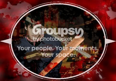
Okay, I followed your advice, TC. Check out the results:

Original:
XanderWishverseExample.jpg


Edited:
XanderWishverseExample2.jpg

What do you guys think?

The necklace is a LOT clearer. The screw has shape, too, although it still seems kind of like it's floating. I also toned down Xander so that he isn't super bright, but now I think I may have gone too far in the opposite direction. lol. I also added a setting.
 
Back
Top Bottom